
In this article, we’ll cover the following:
- Understanding How Google Ranks Pages
- How Mobile-First Will Change Results
- How Will Mobile-First Impact Your Site?
- Best Practices for Separate Content on Mobile vs. Desktop
Mobile users are quickly outpacing desktop users. Google wants mobile-users to find what they’re looking for. Mobile-friendly websites are designed to optimize content for users who are viewing the site on a mobile device.
The website should adjust to the size of the screen and allow users to find what they’re looking for in just a few seconds. In 2015, Google began giving higher rankings to websites that were updated for a better user experience.
Websites were urged to go mobile-friendly after that update. Google never stops its mission of organizing the world’s information and making it universally accessible.
There have been many updates to the algorithms applied to search engine rankings over the past two decades that have increased user experiences. Sites that follow best SEO practices have been rewarded by remaining high in search engine rankings.

Google’s latest update to its search algorithms is all about mobile-first indexing. Mobile-first indexing rewards pages that are mobile-friendly, because more users access the Web through mobile devices.
Sites that are mobile-friendly will rank higher in searches.
What does this mean for individual sites? How will your site be affected? Read on to learn more about mobile-friendly indexing and what you can do to keep your high search engine rankings or improve lower ranked pages.
How Does Google Rank Pages?
Google’s search engine rankings are determined by an algorithm of more than 200 factors.
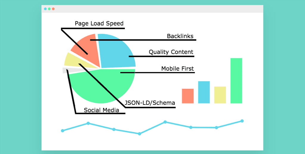
The formula is secret, but most SEO experts agree on the key ranking factors, such as keyword usage, inbound links, site speed and time users spend on the site. Site structure is another key element of search engine ranking.
Google users a huge set of computers to “crawl” billions of pages each day. Each page is processed and indexed through a formula that ranks the page.
When a user enters a query to search for a particular phrase, the index provides results based on what is most relevant to the user.
Although Google’s algorithms are setup by humans, the rankings are determined by the formula. No one from Google (or any other company) can manipulate the specific rankings by the algorithm. The first website listed in the organic search results is the determination of the algorithm.
AdWords links are kept separate from the search side of the business. A website that pays to rank in the AdWords list at the top of a search page do not influence the search results below it. A business cannot pay to rank better in organic search results.
AdWords links are kept separate from the search side of the business. A website that pays to rank in the AdWords list at the top of a search page do not influence the search results below it. A business cannot pay to rank better in organic search results.
How Mobile-First Will Change Search Results
Google ranks web pages in an index that is used when providing search results. Historically, it was the desktop version of the site that was indexed. When mobile users access the desktop version of a page, it can appear much different than the mobile version. The mobile sites will now be the primary baseline for determining rankings. Google crawlers will crawl the mobile version of your site first.
Article: Find out more about an SEO strategy
Mobile-first is the term because it’s not mobile-only. If you only have a desktop site, your site will not be excluded from search results. Google will still index your site. But without a mobile-friendly user experience, Google may drop your rankings. On the other hand, if your site does have a mobile-friendly index, you could rank higher for searchers using a desktop version.
How Does Mobile-First Indexing Impact An SEO Strategy?
This change is in its earliest stages of testing. Google is gradually rolling out the mobile-first indexing across sites that are ready. You will know if your site has shifted to the mobile-first index through notification in your Search Console.
If you only have desktop content, you will be represented in Google’s index. Site owners should not panic.
However, given that mobile-friendly sites will most likely perform better in search results, this change may affect desktop sites that aren’t mobile-friendly simply by pushing them down in rankings in mobile searchers.
If your site is identical in its desktop and mobile versions, you may not have to anything beyond what you’re already doing.
Keep optimizing your pages for the mobile experience. Many sites use responsive web design, which allows the site to respond to whichever operating system the user has.
If you have a separate mobile and desktop sites, which used to be fairly standard, you’ll want to check the following aspects of your site:
- Structured data – the same structured data should be on both the mobile and desktop versions of the site. Don’t add structured data unless it’s relevant to the content.
- Content – the content on your mobile site should have all the content that your desktop site does, including videos and images. Update your mobile site make sure it is crawlable and able to be indexed.
- Metadata – titles and meta descriptions should be equivalent, the same information and relevant keywords need to be included, but you can certainly optimize mobile titles with shorter character counts.
- Social metadata – your mobile version should include OpenGraph tags and Twitter cards and any other social metadata that is used on your desktop version.
- XML and media sitemaps – trust signals, robots directives and links to sitemaps need to be available on your mobile version.
- Verify your mobile site in Google Search Console if you haven’t already.
- App indexation – verify the mobile version if you have this set up for your desktop site.
- Server capacity – If your mobile version is being hosted on a separate site, (such as m.domain.com) will it be able to handle an increased crawl rate.
Best Practices for Separate Mobile and Desktop Content
Google offers these best practices for dynamic serving or separate URLs:
- Your mobile site should have the same content.
- Structured data needs to be present in both versions.
- Metadata needs to be present in both versions.
Common Mistakes Made in Mobile-Friendly Design

What you do on your mobile site directly relates to your search engine rankings. Your SEO strategy cannot include these mistakes:
- Blocked JavaScript, CSS or image files
Allow the Google crawlers to see your site as a normal user does. Test the mobile pages to ensure they are compatible for mobile users. - Unplayable content
Flash and other players are not supported on mobile devices. If you have this kind of content on your desktop version, mobile users will get an error message.
Use HTML5 standard tags and animations that work across all browsers. If nothing else, have a transcript of the video available to make your content accessible for everyone.
- Faulty redirects or irrelevant cross links – If your desktop site is configured to redirect mobile users to the homepage, regardless of which URL was requested, users will not have a good experience on your site. You must redirect mobile users to the appropriate mobile URL.
- Mobile-only 404s – If your site recognizes a mobile user visiting a desktop page, it’s better to redirect them to the mobile page URL instead of giving them an error page. If there is no mobile page, let the user use the desktop page, which is a better experience than the error. Responsive web design gives you the most flexibility, because the content adjusts to the user.
- Avoid intrusive interstitials – Interstitial ads are pop-up banners that appear over the native content. On mobile devices, interstitials can be difficult to dismiss, which negatively affects the user’s experience. Google’s algorithm measures how long users stay on your site. If a user has to deal with an interstitial, they may leave before viewing your content.
- Slow page loading – Beginning in July, Google will make page speed a ranking factor for mobile searches.
Do You Feel More Prepared for How Mobile-First Indexing Will Affect Your Strategy?
Is Your Site Ready for Mobile-First Indexing? Google offers a mobile-friendly test for each page on your site.
